Encore Trophy Studio · buyer guide
Long routine titles on small award plates
For an Encore Trophy Studio worldwide award with a long routine title, confirm the director-approved string and essential event details before shortening anything. Compare natural line breaks, text hierarchy and the actual inscription area. Character count can identify a crowded line, but the final-size proof determines whether the complete approved statement is readable.
Reviewed 2026-09-05 · AI-assisted editorial review. General buying guidance; illustrative scenarios are not customer case studies. Images are AI-generated concepts.
Which version of the routine title is official?
A routine may appear under a working rehearsal title, a program title and a competition registration title. Ask the director or event owner which exact version belongs on the award. Do not combine them or choose the shortest one without approval.
Keep the title linked to the correct routine reference and occasion. Two performances can share similar names, and a later revival may use the same title in another season. The inscription needs enough approved context to distinguish the intended performance without adding every administrative field from the registration system. Identity accuracy comes before typographic convenience.


Which supporting details are essential?
Identify whether a subtitle, song credit, choreographer line or descriptive phrase is part of the official title or optional supporting information. The distinction should come from the authorized source owner. A designer should not remove a phrase that carries the routine's intended meaning simply because it resembles a subtitle.
Once the hierarchy is clear, decide which supporting fields belong on the object. The award may need the event, season and approved result, while a program booklet carries longer credits. Moving optional context elsewhere can preserve the full title without shrinking all the text. Any separate printed item should be specified if it is part of the purchase.
How much usable inscription area does the award have?
Ask for the usable plate or personalization area in the proposed construction, not just the trophy's overall height. A visually large object can have a compact inscription surface, while a simpler plaque may offer a different layout opportunity. Compare actual proposed dimensions and complete scope.
If a catalog image uses a two-word title, request a proof with the real long string before choosing the format. A design that looks balanced with sample wording may not support the required event and recipient information. The buyer should see the difficult layout while changes are still being considered, rather than after the object has been selected and promised.

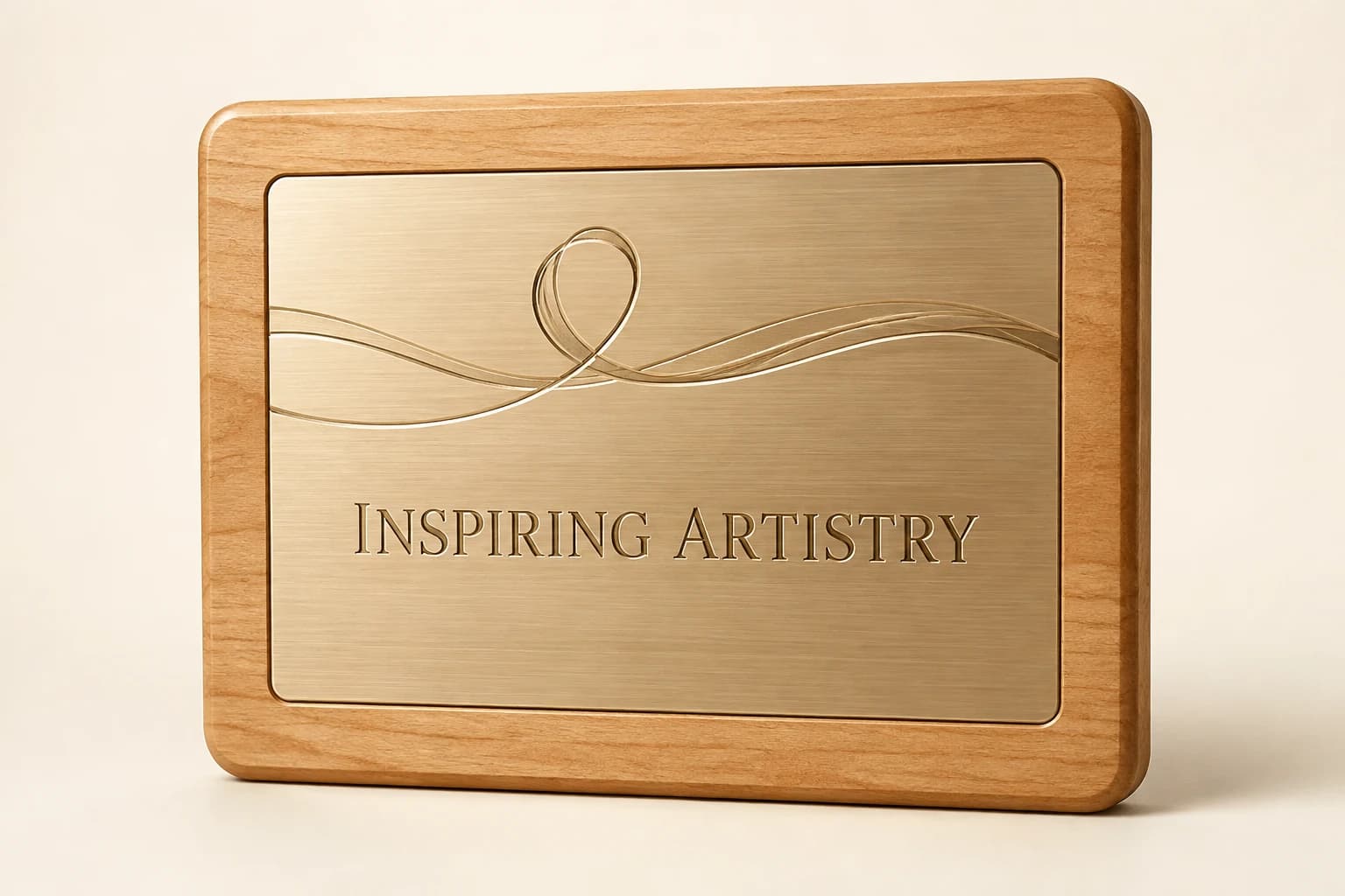
Where should a long routine title break into lines?
Look for natural phrase boundaries in the approved title. A line break can make a long title easier to read without changing its words, but a break in the wrong place can create an unintended emphasis or separate a meaningful pair. Have the director review the complete visual arrangement.
Do not force every line to have the same number of characters. Balanced visual width and clear reading order matter more than numerical symmetry. A short final line can be appropriate if it preserves the title's phrasing. The text checker helps identify lengths, while the actual proof shows how the chosen font and layout perform.
Unicode Annex 29 distinguishes grapheme-cluster segmentation from line-break rules.
Compare the approved routine-title line lengths
The full fictional title contains twenty-nine visible characters on one line. Its selected two-line form contains thirteen and fifteen characters because the separating space becomes a line break. Load that approved illustrative split to check twenty-eight visible characters, then assess the real title and supporting fields in an actual-size proof.
Method: Count visible characters by line against the chosen text budget; the result does not establish physical fit.
Build your plan
Counts include spaces and punctuation. Character count cannot establish physical fit: font, script, layout, material and engraving area require a proof at actual size.
Use the article’s example files
Sample rows are fictional planning examples. Replace them with authorized information and retain the approval references privately; this file is not a production release.
Should every line be reduced to fit the title?
When a title is long, reducing all type can make the dancer, event and result unnecessarily difficult to read. Ask which field should remain most prominent and which supporting information can move or use a different hierarchy. A targeted layout revision may solve the problem without reducing every element equally.
Keep the recipient's identity protected. A personal award should not make the dancer's name barely visible because the routine title consumed the whole area. If the complete approved statement cannot be presented clearly on the chosen format, compare a different inscription area or object before accepting a crowded layout as inevitable.
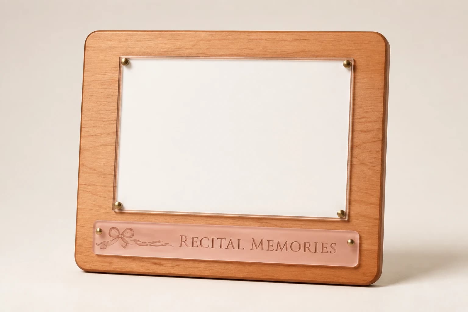
Who approves a shortened routine title?
If the director chooses a shortened title, record the exact approved display form and its relationship to the full routine title. A shortened version is a content decision, not a routine design cleanup. Keep both in the private order record so a replacement can reproduce the intended version.
Avoid ambiguous initials that could identify another routine or erase the title's recognizable phrase. A shortened subtitle may work when the director approves it, while cutting a central word may change the meaning. Show the proposed full inscription to the reviewer rather than asking for general permission to abbreviate anything that does not fit.
Which punctuation belongs in the exact title?
Titles may contain a colon, dash, apostrophe or intentional punctuation that affects their identity. Confirm which marks belong in the approved title and which were added by a program's styling. Do not remove them all automatically or add decorative quotation marks that consume space without serving the intended wording.
If text is copied from a registration platform, inspect unusual spacing or substituted characters. The final proof should display the exact approved result. A visually similar mark can still be wrong if the title owner has specified a particular form. Resolve the source string before asking production to optimize its layout.
How should the competition category stay accurate?
A competition award may need the routine title alongside its approved category and result. Ask the event owner which exact statement is required. A long title does not authorize replacing a detailed division with a broader, more impressive-sounding category. Preserve the approved category.
If the organizer permits a concise display label, have it approved and retain the full source reference privately. The finished object should remain an accurate record of the actual recognition. Where space is insufficient for essential context, reconsider the layout or format rather than silently omitting the distinction that explains what the routine achieved.
How do you proof an original-script routine title?
A routine title may be intentionally written in another language or script. Obtain the exact approved string and a competent review of any translated display form. Do not transliterate or translate it simply because the designer's default font does not support the original.
Ask production to show the actual characters in the proposed method and layout. If an alternative treatment is needed, return it for approval. Two language versions can require more space than one, and equal character counts do not establish equivalent meaning or physical width. Preserve the title's intended identity while resolving the real typography constraints.
What happens when the director renames the routine?
A director may rename a routine after an early draft. Identify the new title clearly, confirm which event or season it applies to and replace the full string in the affected order items. Do not rely on an informal message that the new title is obvious from the latest program.
Recheck the layout after the change, even if the new wording is shorter. Different words can shift line breaks and emphasis. Keep the final approved title, supporting fields and proof revision together so production does not combine a new heading with an old category line or use the earlier design for one personalized variant.
Will the title still make sense after the recital?
Imagine the award displayed at home without the program booklet nearby. The reader should be able to identify the routine and the approved occasion from the inscription's chosen context. A long title can remain distinctive, but an unexplained cluster of initials may lose meaning quickly.
Save the complete approved wording for replacements and later studio archives. If the routine is revived, do not automatically change an older award to the new season or cast. A historical piece records its original approved performance. A new production can use a related visual design while receiving a fresh title, category and recipient review.
How does the illustrative example reconcile?
The fictional title When the City Learns to Dance contains 29 visible characters. On one line it exceeds a chosen twenty-character budget by nine. The director instead approves two lines: When the City, with 13 characters, and Learns to Dance, with 15. The two-line version contains 28 characters because the separating space becomes a line break.
Load the two-line version in the checker. It reports twenty-eight characters across two lines and a longest line of fifteen, both within the chosen budget. This does not establish physical fit or authorize the title change for any real routine.
The worksheet preserves the full title and the approved illustrative line break. A real order still needs the director's exact title approval and an actual-size proof containing any required recipient, event and result information. Those additional lines must be reviewed as part of the complete composition.
Which approach matches the approved program?
Keep the full routine title with natural line breaks where the approved area supports it. Use a shortened form only after the title owner approves that exact wording. If essential context still cannot be read clearly, compare another inscription area rather than shrinking every line or removing the meaning of the award.
| Option | Useful when | Decision to resolve |
|---|---|---|
| Full title with natural line breaks | The approved words can remain readable in the proposed area. | Director review of reading order and final-size layout. |
| Approved shortened display title | The title owner accepts a specific concise form. | Retain its link to the full historical title. |
| Different inscription area | Essential context cannot fit clearly in the selected format. | Compare complete dimensions and scope before choosing. |
What should you know before ordering?
Long-title planning begins with the exact routine identity and the usable inscription area. A shorter string can still be wrong, while a taller object may offer no more plate space. These questions explain quotation scope, abbreviations, line-break counts and late title changes without treating the text checker as physical-fit approval.
Does a longer routine title always cost more to engrave?
Do not assume a price rule without the actual quote. The selected inscription area, personalization method, layout work and any changed construction define the scope. Ask Encore Trophy Studio to review the full approved title and required context, then compare the quoted options for presenting that complete statement clearly.
Can the title be abbreviated automatically?
No. Ask the title owner to approve the exact shortened display form. A routine title is part of the performance’s identity, and removing a central phrase can change its meaning. Retain the approved short form alongside the full title so replacements reproduce the intended historical wording.
Does a taller trophy solve a long-title problem?
Not necessarily. Review the usable inscription area, which can differ from the object’s overall size. A tall trophy may still have a compact plate. Ask for a proof using the real title and all essential supporting text before choosing the format or assuming a larger silhouette provides more room.
Why does the two-line example contain one fewer visible character?
The space between the phrases becomes a line break. The checker totals visible characters within each line and reports the number of lines separately. This arithmetic helps explain the sample, but it does not establish physical fit or authorize a new line break for an actual director’s title.
What if the title changes after the proof is approved?
Issue the exact new string, identify the affected routine and confirm the production status. Recheck the layout even if the new title is shorter, because different words can change line breaks and emphasis. Keep the final title revision and matching visual proof connected for every affected item.
Sources and scope
The sources below support the cited technical details. The ordering workflows are editorial recommendations. Your project specification, price and schedule are established in the written quote and approved proof.
- Unicode Consortium: Unicode Text Segmentation · checked 2026-09-05
Which buying guide should you read next?
All buying guidesWrite studio and teacher award inscriptions around an approved recipient, occasion and specific contribution, keeping appreciation separate from competition results and unsupported superlatives.
Count individual keepsakes by approved dancer recipients and shared trophies by routines or teams, then connect each object to its own inscription and final owner.